The short answer
A strong local-business website makes the buying decision easier. It shows the right proof early, uses real business imagery and gives each customer a clear next step. The layout should change with the job being sold.
These two examples are live Australian builds. They use different visual systems because the businesses solve different problems. The teardown focuses on decisions visible on the page. It does not invent conversion or ranking results.
Example one: McDonald Roofing Company
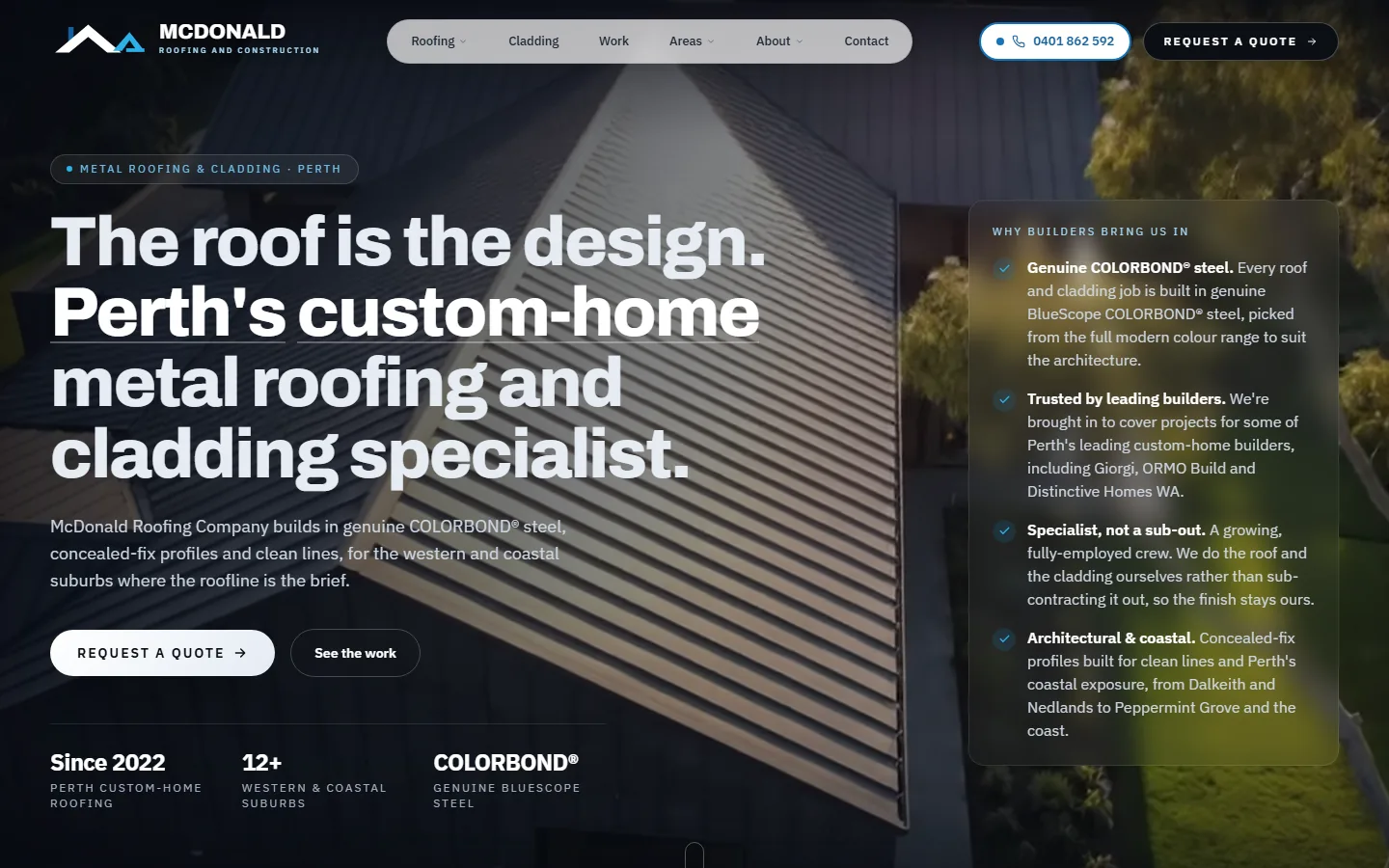
McDonald Roofing Company is positioned as a metal roofing and architectural cladding specialist for Perth custom homes. The homepage does not present roofing as a generic household service.
What the hero communicates
The opening statement names the material, market and location: custom-home metal roofing and cladding in Perth. A visitor can tell that the company is suited to architectural work before reading the supporting paragraph.
The background is a real roofing and cladding image, not a stock photograph of a person holding a drill. That choice matters because the finish is the product. The photograph demonstrates the type of work the business wants to quote.
Proof is matched to the buyer
The page surfaces genuine COLORBOND steel, named builder relationships and specialist employment structure. Those details are more relevant to a custom-home builder than a generic row of five-star icons.
The proof panel sits beside the main offer, so the visitor does not need to scroll to an About page to establish whether the company handles specialist work.
Enquiry paths are separated
The page offers a quote action and a route into completed work. This suits a high-consideration project. A builder or homeowner can inspect capability before making contact, while a ready buyer can request a quote immediately.
What another trade can borrow
- name the work you most want, not every service you could perform
- use the finished work as the main visual evidence
- put specialist qualifications or materials near the first enquiry action
- let project work qualify the customer before a form submission
Read the full McDonald Roofing Company case study for the site structure and content decisions behind the build.
Example two: The Fruit Basket
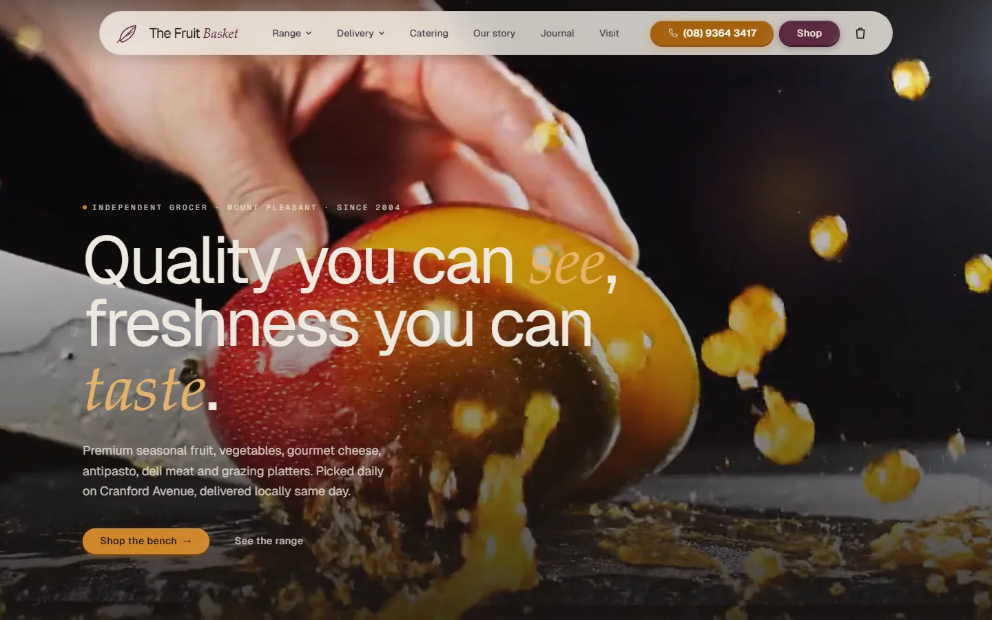
The Fruit Basket is an independent greengrocer in Mount Pleasant. Its homepage needs to sell freshness, range and convenience rather than a technical service.
The product becomes the hero
The first frame shows produce being cut, with movement and texture that a generic supermarket photograph cannot reproduce. The headline supports what the customer can already see.
The navigation prioritises range, delivery, catering, store information and shopping. Those are the practical decisions a customer makes before visiting or ordering.
Local information stays visible
The page identifies the store as an independent Mount Pleasant grocer and keeps the phone number prominent. The business’s physical location and same-day service are central to the offer, so the design does not hide them behind broad lifestyle copy.
The actions match two customer modes
One visitor wants to browse the range. Another is ready to shop. Both paths are available without turning the hero into a dense list of features.
What another local shop can borrow
- use the real product or premises as the main visual
- structure navigation around customer tasks
- make location, opening and ordering information easy to reach
- keep the primary shopping action distinct from general browsing
Read the Fruit Basket Perth case study for the local search, content and ordering structure.
The common system underneath
The two sites look different, but the useful foundations are consistent:
| Foundation | McDonald Roofing | The Fruit Basket |
|---|---|---|
| Clear category | Metal roofing and cladding | Independent greengrocer |
| Real visual proof | Completed architectural work | Produce and store experience |
| Local relevance | Perth western and coastal work | Mount Pleasant store and delivery |
| Primary action | Request a quote | Shop |
| Secondary action | See completed work | Browse the range |
| Trust detail | Materials and builder relationships | Store identity and product freshness |
This is the distinction between a reusable technical system and a visible template. Code, performance and SEO foundations can be standardised. The buying decision, proof and art direction should not be.
How to assess another website example
When reviewing a competitor or inspiration site, ask:
- Can a new visitor identify the service and area in five seconds?
- Is the main image evidence from the real business?
- Does the first proof match the customer’s biggest concern?
- Is the next action clear on a phone?
- Do service and location pages answer distinct questions?
- Are reviews, licences and outcomes verifiable?
A website can look polished and still fail these checks. Use the 30-point tradie website and local SEO checklist for a complete review.
Frequently asked questions
What should a good tradie website show above the fold?
It should identify the service, service area and next action without making the visitor search. The strongest proof varies by business and can include a licence, real project image, material specialisation, response information or customer evidence.
Should every local-business website use the same layout?
No. A roofing specialist selling high-value architectural work and a greengrocer selling fresh produce have different customer questions. The site structure, imagery and enquiry path should reflect the buying decision.
Are these websites templates?
No. Both sites use a common technical foundation, but their art direction, information hierarchy, proof and conversion paths were fitted to the individual business.
Do attractive websites automatically rank on Google?
No. Visual quality can improve trust and engagement, but search visibility also depends on indexability, useful content, business relevance, local prominence and competition.